ONTO
Created for the York U's 2024 DESNathon, ONTO explores how play and competition can unite people rather than divide them. The identity adapts across different event types, from sports to video games, all while maintaining a strong visual foundation that is centered on participation, collective energy, and community.
The name "ONTO" was made by combining the the first two letters of Ontario and Toronto, grounding the scope of the project to local contexts. Put together, these letters created opportunities for dynamic and flexible wordplay, allowing the brand to generate different combinations of copy and meanings. The overall goal with the name was to capture both movement and participation, inviting people to get "onto" an event or shared experience.


The ONTO wordmark is made to be bold, direct, and simple, allowing it to function as a strong visual anchor across brand assets. The solid typographic structure reflects the brand's sense of energy and momentum, all while keeping the visual identity to be approachable and adaptable across different event contexts.
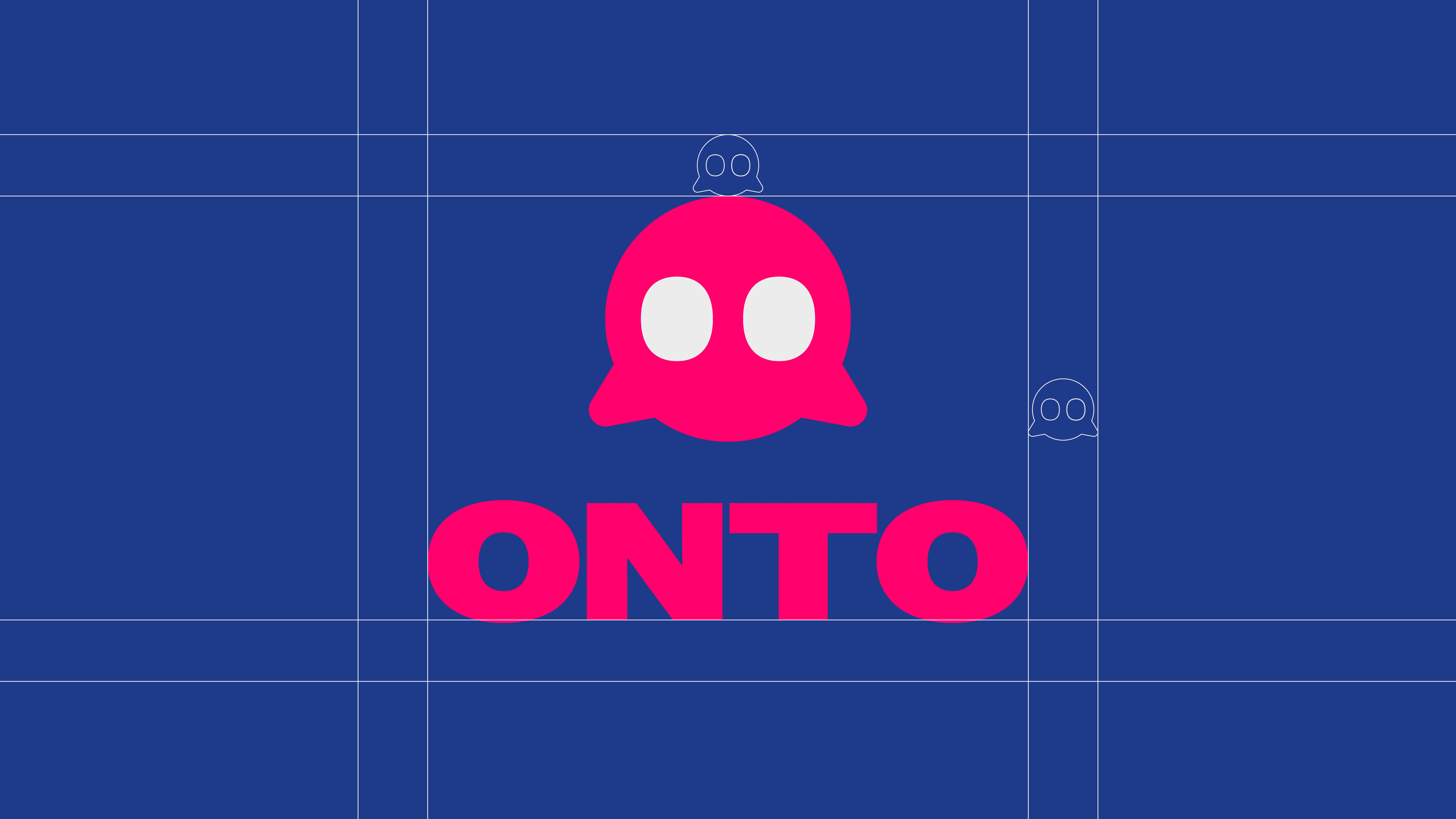
Orbit Represents the community that is centered at the heart of the brand. Through the simplified shape and expressive eyes of our sprite-icon, we reinforce our friendly and approachable, but bold, personality that reflects critical themes of inclusivity, participation, and shared experiences.


The visual identity system balances a consistent typographic foundation with adaptable visual styles that spans across photography to illustrations. This allows the brand to shift across different events while maintaining a recognizable structure.
ONTO's colors are vibrant and expressive. It's main colors reflect the city of Toronto, once again, framing the brand's setting and making it clear who we are communicating too. The expressiveness and boldness of the main colors reflect the overall energy of games, competition, and shared experiences. The tertiary colors, further reflects the idea of community within Toronto, providing a variety colors to represent the variety of individuals in Toronto's community.


Event posters serve as ONTO's primary tool for communication. Through combining bold messaging, easy to read composition, and strong visuals, ONTO is able to promote to different events to different communities and audiences, all while having the same goal, to bring together the people of Toronto.
Hi! I am Gabriel Paragas, a young creative who is specializing in
blending motion and brand identities together. I am all about
experimenting and implementing, bridging the gap between design
and dynamic storytelling. Whatever I am creating, whether it’s a
static design piece or a dynamic motion loop or animatic, my goal is
the same: to create and design something that moves people.